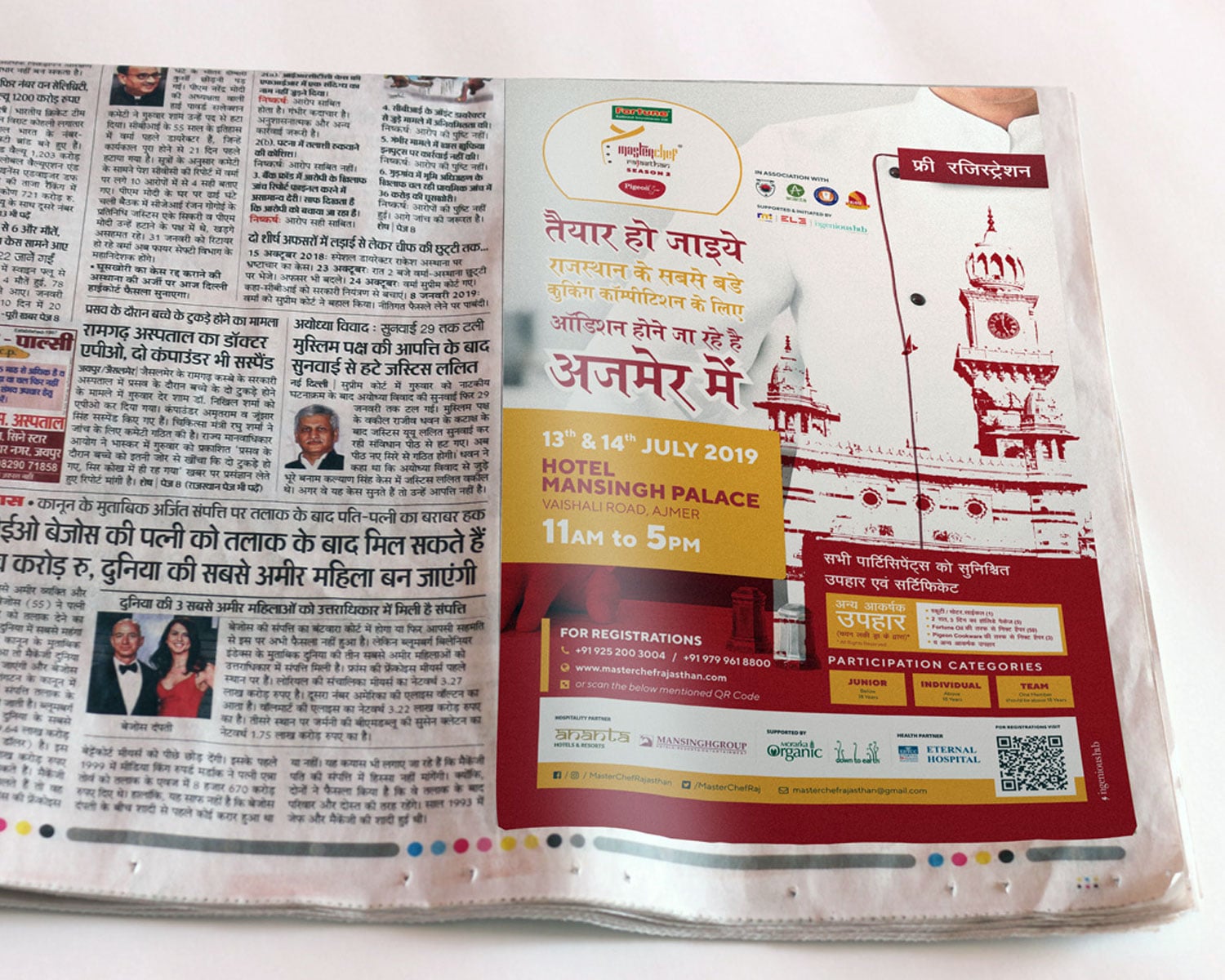
A print job goes wrong in small ways: a white edge on one side, text too close to the cut, colours duller than the screen, a blurry photo. Almost all of them can be avoided if the file is prepared the way the printer expects. This is a plain checklist for cards, flyers, brochures and packs. Your printer's own instructions always win, so ask them first.
Ask the printer three things first
- The finished size and the bleed they want. Many printers ask for 3 mm, and some ask for more.
- The file type they prefer. A print-ready PDF is the usual answer.
- Whether they have a template for the product, such as a die line for a box or a mailer.
The checklist
| Item | What to do | Why |
|---|---|---|
| Colour mode | Design in CMYK for print. | Screens use RGB. Bright screen colours often look duller on paper, so check a proof. |
| Bleed | Extend the background or image past the cut line by the amount the printer asks. | Paper is cut by a machine and moves a little. Bleed stops a white edge. |
| Safe margin | Keep text and logos well inside the cut line. | Anything near the edge can be trimmed off. |
| Resolution | Use images made for print, commonly around 300 pixels per inch at the printed size. | A web image enlarged for print looks soft. |
| Fonts | Convert text to outlines, or embed fonts in the PDF. | A missing font is replaced by another and changes the layout. |
| Black | Use one clear black for text and check how a large black area prints. | Different blacks look different on paper. |
| Pages and order | Send single pages in the right order, or as the printer asks. | A different order can mean wrong pairs on a folded sheet. |
| File | Export a PDF with the settings the printer gave you. | A flat, correct file avoids surprises. |
The word bleed is the part of the design that runs past the edge on purpose. If your artwork has a background colour or a photo that touches the edge, it needs bleed. If it has a white border on purpose, it does not.
Check colour with a proof
The colour you see on a phone is made of light. The colour on paper is made of ink, and it depends on the paper, the press and the day. For a logo colour or a pack where the colour matters, ask for a proof, and look at it in daylight. Approve it in writing before the full run. If your brand colours have been matched for print, keep that reference with you; our colour palette builder helps you record them in the formats you need, and the print size calculator helps you check sizes before you start.
Choosing paper and finish
The same design looks different on different paper. Matte feels calm and reads well. Gloss makes colour pop and shows fingerprints. Textured paper feels premium and can soften fine detail. Special finishes such as foil, embossing or spot varnish add cost and time and need artwork prepared in layers, so decide early and ask the printer to explain what they need from you.
What to send the printer
- The print-ready PDF, named clearly with the product and the size.
- A low-resolution preview image, so they can see what you meant.
- A short note with quantity, paper, finish and the date you need it.
- Your logo files in vector form, in case they need to adjust something. Our note on the logo files every business should own lists them.
Before you approve
Read every word again, including the phone number and the address. Check that colours match the proof. Check that nothing sits too close to the edge. Print a copy at full size on an office printer and hold it in your hand. Most mistakes can be seen at that stage, and they cost far less to fix than a run of five thousand.
If you work with a studio, the finished files should come with a print-ready pack for each item, and with your brand guidelines so your next job looks like the last one. See our creative and packaging work if you want help with a pack.