
From a classroom to a national institute.
Repositioned through identity and messaging, with admissions assets that look the part of a top-tier institute.
Allegiance Education · Edtech · Test Prep

- Allegiance Education
- Brand Strategy
- Identity
The result
- admissions, next intake
- +62%
- cities, no redesign
- 3
- counsellor-meeting → close
- 10×
The story
The problem
Allegiance had the strongest faculty in its bracket and the weakest brand. Parents arrived knowing the cohort produced ranks; they left unsure why this was the institute their child should join. Admissions teams were spending the first ten minutes of every conversation undoing first impressions.
The thinking
We argued the wrong audience was being addressed. The student isn't the buyer in test-prep. The parent is. So we shifted the entire brand axis from achievement language to outcome language: cohorts, college pipelines, mentor-to-student ratios, the things a parent is actually scoring you on.
From there, the rebrand designed itself. The wordmark needed to feel institutional, not a coaching-centre. The colour system needed to read as legitimate at scale. The admissions print system needed to do the work the conversation kept failing at.
The execution
We led with strategy, then ran the system across every touchpoint a parent meets before signing: wordmark, prospectus, admissions counsellor decks, city-launch playbook. Everything carried the same argument.
- Brand strategy & positioning briefThe written argument the identity is built on: who the brand is for, what it promises and why it should be believed. Every later design decision is checked against it.
- Wordmark & identity systemThe mark itself, drawn with construction rules, clear space and minimum sizes. It holds from a favicon to a hoarding. The rules around it keep the brand recognisable even without it.
- Admissions prospectus (76 pp)The document a parent or buyer reads before deciding. It is built so the argument lands in the first spread, not the last.
- Counsellor sales decksThe deck a person leans on in the room. It carries the brand's argument so the conversation stops spending its first minutes undoing a weak first impression.
- City-launch operations playbookA written operating guide. The next city or shop can run the system from it without commissioning new design.
- Print collateral suite (banners, brochures, danglers)The banners, brochures and danglers people actually see. They are designed as one system across every size, which makes the brand recognisable at a glance.
The impact
62% more admissions in the next intake, with the same faculty and the same fee structure. Only the brand was sharper. The system rolled into three new cities without a single piece of net-new design.
In the client’s words
They understood our business before designing anything. The results spoke for themselves.
How work like this runs
Allegiance Education’s published scope was brand strategy, identity and print. This is how our branding & identity work is run, from first conversation to handover.
Listen and audit
We read your category and your customers, then your current materials. We note where the brand argues with itself.
Find the position
One clear argument, written down in plain language before any pixel is drawn.
Design the system
The chosen route becomes a full identity. It covers the mark and the colour, the type and the imagery, with the rules to keep them together.
Apply and hand over
We design the real applications: print, packaging, digital, then document the system so your team can run it.
If you are facing something similar
Before you commission a rebrand or a first identity: six things worth settling first, whoever you hire.
Write the argument in one sentence
Who is the brand for, and how has the market got it wrong? If that sentence cannot be written, a logo will not fix it.
Name who actually decides
The user is not always the buyer. The person signing the cheque needs a different message and tone, and a different proof to lead with.
Decide what must stay recognisable
A refresh keeps a thread of the old brand; a rebrand cuts it. Choosing which one you need saves weeks of circular feedback.
Plan the rollout, not just the reveal
Signage, packaging and stationery do not change on the same day as the website. A phased list stops old and new versions of the brand sitting side by side for months.
Answer the parent's questions on the page
Outcomes, mentors, pathways and fees are what a parent is scoring you on. Put them where nobody can miss them.
Look like an institution, not a coaching stall
Legitimacy is visual. Consistent print and signage tell a parent this place will still be here next year. The documents say the same.
What usually goes wrong
Three patterns we meet often in branding & identity work, and the quiet cost of each.
Starting with the logo
A mark drawn before the argument is settled gets judged on taste. Three rounds later nobody remembers what it was supposed to say.
Borrowing the category's look
If every competitor uses the same blue and the same symbol, matching them makes you invisible. The category's habits are the first thing to question.
Too many approvers
Feedback from eight people averages into a design nobody dislikes and nobody remembers. Agree one decision-maker and two voices before the first presentation.
Where this sits
Strategic positioning and a visual identity that earns the price you want to charge.
- Yug VaastraHeritage that ships
- DNS PointersA precise mark for a precise consultancy
- VolimyA debossed mark for a category-creator
We've learned the difference between edtech-trying-to-look-like-fintech and edtech that sounds like itself.
Education is a category where the person using the service and the person paying for it are often different, and the decision is made under anxiety about the next few years of someone's life.
Brands in this space tend to look alike: the same colours, the same graduate in a gown, the same promise. The ones that stand out look like institutions and answer the questions a parent is actually weighing.
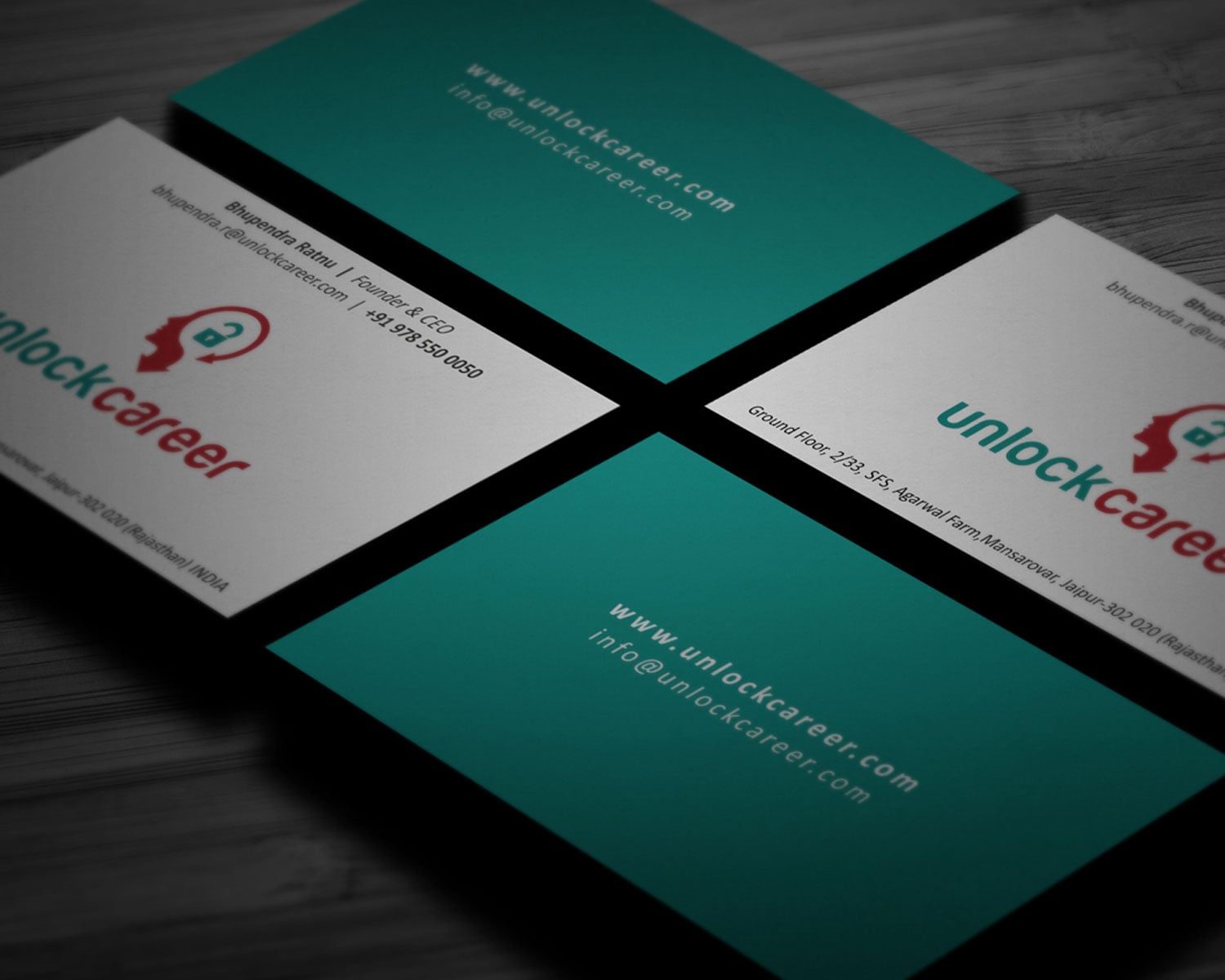
- Unlock CareerA site that books calls on autopilot
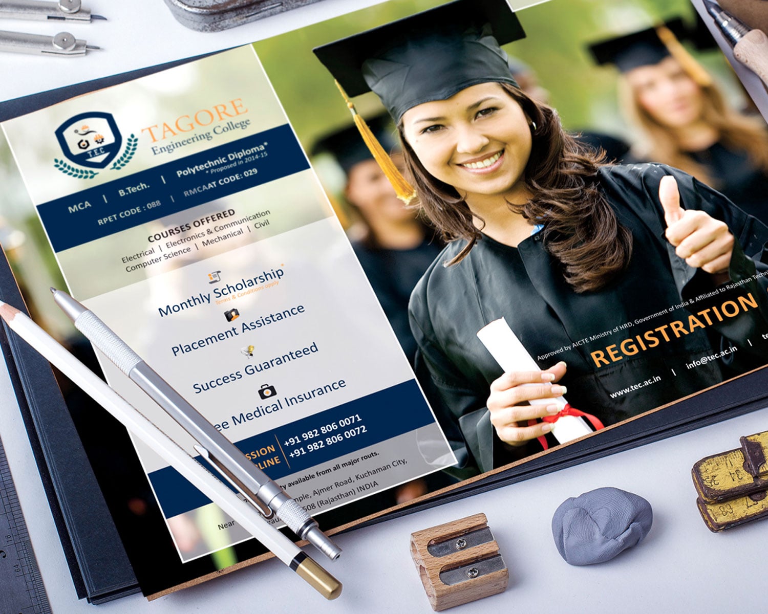
- Tagore Engineering CollegeA crest worth its lineage
Questions about projects like this.
Something we haven’t covered? Ask us.
What did the Allegiance Education project include?
The published scope was brand strategy, identity and print, for Allegiance Education (Edtech, Test Prep). The pieces delivered are listed above, with what each is for.
Do you design the applications too, or only the logo?
Applications are the point, because that is where a brand is judged. Stationery, packaging, print, signage and digital surfaces are all designed as part of the system.
How do you decide between a refresh and a full rebrand?
We look at what the old brand has earned. If customers already recognise and trust the name and the look, we evolve it; if the identity is arguing against the price or the audience you now serve, we start again. We tell you which we think it is before you commit.
Will we get the source files and the right to use them?
Handover includes the agreed final marks and the source files, with font information. Your printer or your next designer can work without calling us.
Do you take on more Edtech projects like Allegiance Education?
Yes. Allegiance Education is one of our published Education & Edtech projects, and the Edtech page lists the others along with how we approach the category, so you can judge the fit before you write.
Who is an education brand really talking to?
Often two people: the student who uses it and the parent who decides and pays. We design the message and the proof for the decision-maker, then make sure the student wants to be there.
Does an institute need different branding from an edtech product?
Usually yes. An institute has to feel established and trustworthy at sign-up; a product has to feel modern and easy. The visual language and the proof differ accordingly.

Have a brief like this one? Let’s talk about your branding & identity.
We reply within four working hours, from a person.
See what Branding & Identity starts atFree brand audit
Based in Rajasthan? Branding Agency in Jaipur