
A precise mark for a precise consultancy.
Wordmark, target-arrow monogram, and LinkedIn-first founder branding that helped close two enterprise pilots.
DNS Pointers · B2B · Consulting
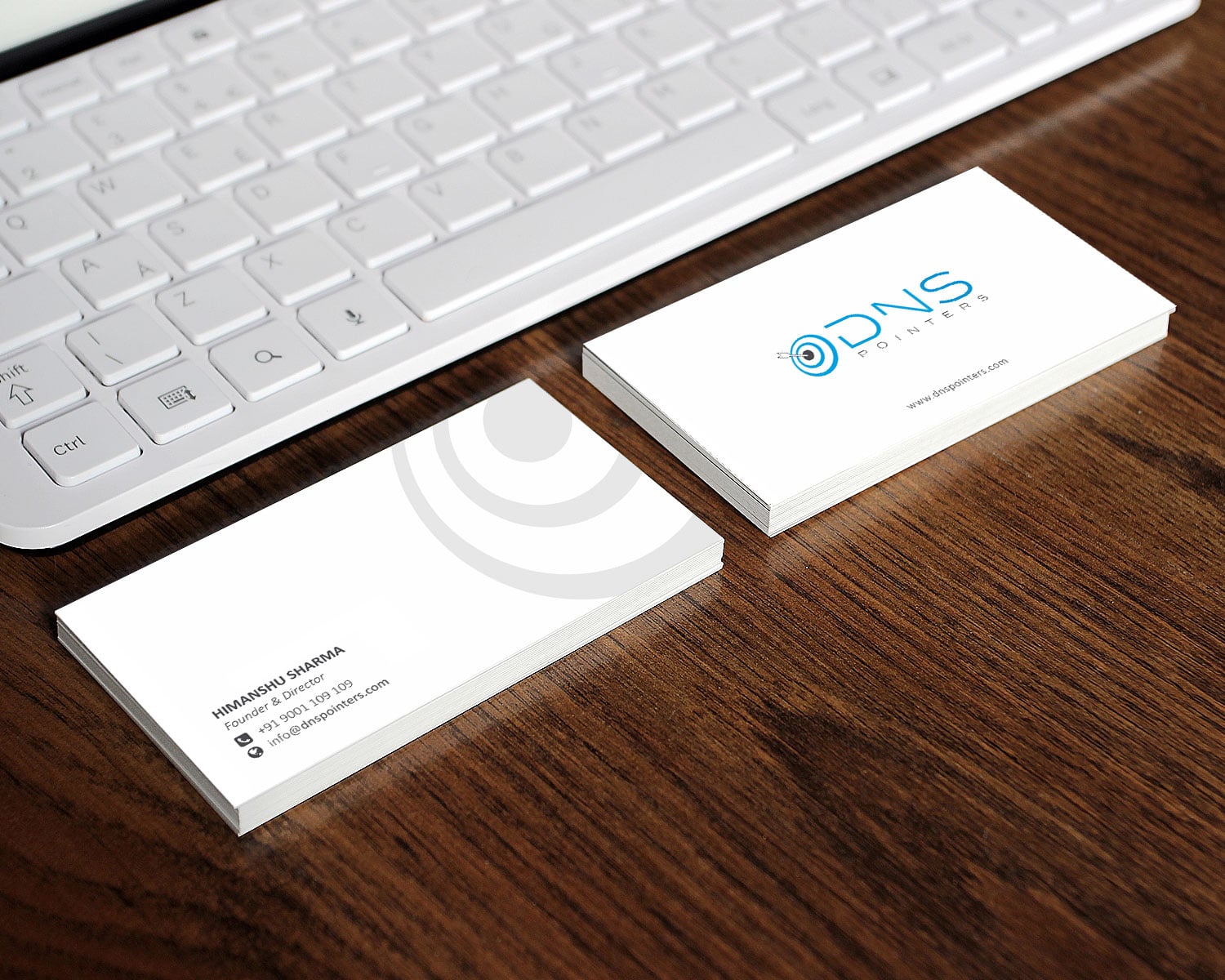
- DNS Pointers
- Identity
- Founder Branding
The result
- enterprise pilots closed
- 2
- founder followers / 90d
- +5.7k
- paid promotion
- 0
The story
The problem
A precise consultancy with a generic brand. DNS Pointers was winning interviews on LinkedIn referrals but losing the room when prospects landed on a brand that looked like a freelancer's portfolio.
The thinking
We treated the founder and the consultancy as one brand. The wordmark needed to carry to a LinkedIn header, an email signature, and an enterprise pitch deck without code-switching.
The target-arrow monogram became the through-line: a quiet, technical mark that pairs with strict typography and a clean LinkedIn-first founder presence.
The execution
Identity, founder branding system (LinkedIn header, content templates, pitch deck), email & document templates. Lightweight, durable, ready for the next decade.
- Wordmark & monogramThe mark itself, drawn with construction rules, clear space and minimum sizes. It holds from a favicon to a hoarding. The rules around it keep the brand recognisable even without it.
- LinkedIn founder branding kitA consistent profile, banner, headline and content format for a founder. Personal visibility then works for the company.
- Pitch deck template (Keynote + Google Slides)The deck a person leans on in the room. It carries the brand's argument so the conversation stops spending its first minutes undoing a weak first impression.
- Email signature & document systemThe everyday documents (signatures, proposals, invoices) set to the identity, so small touchpoints look as considered as large ones.
The impact
Two enterprise pilots closed in the launch quarter. The founder's LinkedIn followers grew by 5,700 in 90 days, without paid promotion.
How work like this runs
DNS Pointers’s published scope was identity, founder branding and linkedin. This is how our branding & identity work is run, from first conversation to handover.
Listen and audit
We read your category and your customers, then your current materials. We note where the brand argues with itself.
Sketch directions
Concept routes on paper first: cheap to throw away, expensive to fall in love with.
Design the system
The chosen route becomes a full identity. It covers the mark and the colour, the type and the imagery, with the rules to keep them together.
Apply and hand over
We design the real applications: print, packaging, digital, then document the system so your team can run it.
If you are facing something similar
Before you commission a rebrand or a first identity: six things worth settling first, whoever you hire.
Name who actually decides
The user is not always the buyer. The person signing the cheque needs a different message and tone, and a different proof to lead with.
Decide what must stay recognisable
A refresh keeps a thread of the old brand; a rebrand cuts it. Choosing which one you need saves weeks of circular feedback.
Plan the rollout, not just the reveal
Signage, packaging and stationery do not change on the same day as the website. A phased list stops old and new versions of the brand sitting side by side for months.
Write the argument in one sentence
Who is the brand for, and how has the market got it wrong? If that sentence cannot be written, a logo will not fix it.
Explain the product in one honest sentence
If a buyer cannot repeat what you do after thirty seconds, the sales team will spend meetings fixing it.
Give the sales team assets that work alone
A deck, a one-pager and a site. Between them they make the case when no one is in the room.
What usually goes wrong
Three patterns we meet often in branding & identity work, and the quiet cost of each.
Forgetting the small surfaces
Invoices, email signatures and WhatsApp profile pictures get seen more often than the hoarding. Leave them unchanged and the new brand looks unfinished.
Treating launch day as the finish
An identity matters in the second year, when a new person has to apply it. Without templates and rules it drifts back to whatever is quickest.
Starting with the logo
A mark drawn before the argument is settled gets judged on taste. Three rounds later nobody remembers what it was supposed to say.
Where this sits
Strategic positioning and a visual identity that earns the price you want to charge.
- Allegiance EducationFrom a classroom to a national institute
- Yug VaastraHeritage that ships
- VolimyA debossed mark for a category-creator
Products with technical buyers and storytelling problems. We make the case the product can't make alone.
B2B and technology companies usually sell to technical, cautious, busy buyers. The product is often hard to explain. The deal rests on whether the company looks reliable.
Three problems come up most. The product cannot make its own case. The pitch changes with each salesperson. The website reads like a feature list.
- WooCom ProA SaaS site that talks like an operator
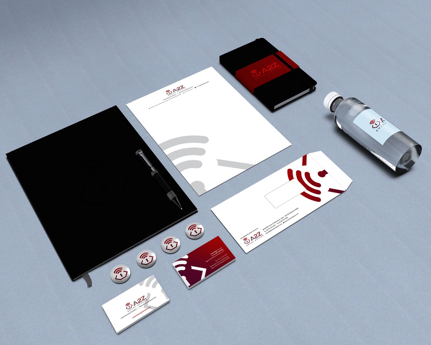
- A2Z Smart SpacesIdentity + collateral for smart-city services
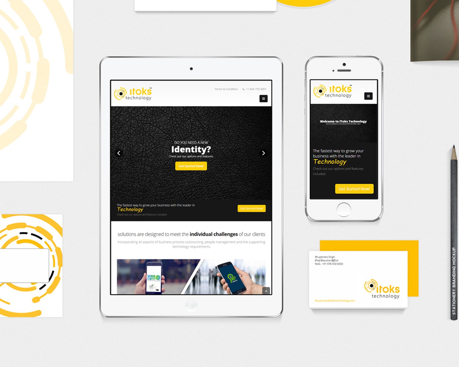
- iTeks TechnologyA wordmark with a wink
Questions about projects like this.
Something we haven’t covered? Ask us.
What did the DNS Pointers project include?
The published scope was identity, founder branding and linkedin, for DNS Pointers (B2B, Consulting). The pieces delivered are listed above, with what each is for.
How do you decide between a refresh and a full rebrand?
We look at what the old brand has earned. If customers already recognise and trust the name and the look, we evolve it; if the identity is arguing against the price or the audience you now serve, we start again. We tell you which we think it is before you commit.
Will we get the source files and the right to use them?
Handover includes the agreed final marks and the source files, with font information. Your printer or your next designer can work without calling us.
Do you design the applications too, or only the logo?
Applications are the point, because that is where a brand is judged. Stationery, packaging, print, signage and digital surfaces are all designed as part of the system.
Do you take on more B2B / Tech projects like DNS Pointers?
Yes. DNS Pointers is one of our published B2B & Technology projects, and the B2B / Tech page lists the others along with how we approach the category, so you can judge the fit before you write.
How can branding shorten a B2B sales cycle?
By making the company look credible and its pitch clear before the first call. A consistent deck, site and identity get the buyer to confidence faster.
Does a small tech company need a full identity system?
It needs enough to look consistent wherever buyers look: the site, the deck, the email signature. We scope to that. A brand book nobody opens is not the aim.

Have a brief like this one? Let’s talk about your branding & identity.
We reply within four working hours, from a person.
See what Branding & Identity starts atFree brand audit
Based in Rajasthan? Branding Agency in Jaipur