
A site that books calls on autopilot.
Replaced a templated build with a custom site, sharper offer page, and calendar-led booking flow.
Unlock Career · Career · Coaching
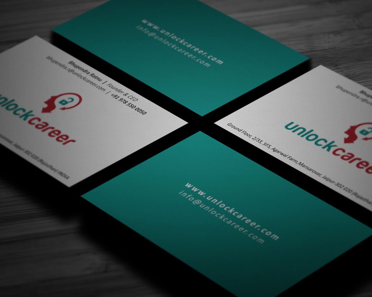
- Unlock Career
- UI/UX
- Development
- CRO
The result
- visit-to-call
- 5.4%
- LCP improvement
- −1.8s
The story
The problem
A templated WordPress site was leaking the right kind of leads. Counsellors were chasing form-submits that never showed up to discovery calls. The problem wasn't traffic; it was the gap between intent and action.
The thinking
We rebuilt the site around a single decision: book the discovery call. Everything else (programmes, mentors, fees) got demoted to inputs that justify the decision.
The booking flow was the design challenge: calendar-led, transparent on price, with an honest 'is this for you?' qualifier built into the funnel.
The execution
Custom Next.js build, Cal.com-integrated booking, sharper offer page, conversion-led IA, and a CRO audit baked into the launch sprint.
- Information architectureThe structure of a site: what goes where and in what order, decided before any screen is designed.
- Custom site build (Next.js)The build itself: code that turns the design into a fast, accessible site. Nothing stands between the visitor and the decision.
- Cal.com booking integrationA scheduling tool wired into the site, so a visitor can book a call without leaving the page.
- Programme & mentor pagesPages that let a prospective student see what they are signing up for and who will teach them.
- Performance audit (LCP, CLS)A measured check of load speed and layout stability, with the fixes that matter ranked by effect.
The impact
Visitor-to-call rate moved from <1% to 5.4%. LCP improved by 1.8 seconds. The team finally stopped chasing dead form-submits.
How work like this runs
Unlock Career’s published scope was ui/ux, development and cro. This is how our website & ui/ux work is run, from first conversation to handover.
Find the leak
We look at where visitors arrive and where they drop out. We look at what the page asks of them.
Design the system
Page templates and components built from your identity, not stock themes.
Build for speed and access
Semantic HTML and keyboard support. Screen readers work. There are performance budgets and a search-ready structure.
Measure and tune
After launch we track enquiries, speed and how quickly visitors understand you. Changes are made on evidence.
If you are facing something similar
Before you commission a website: six things worth settling first, whoever you hire.
Treat accessibility as a requirement
Keyboard support, readable contrast and a proper page structure help every visitor. Search engines read the page better too.
Say who the page is for
A parent, a procurement lead and a founder read the same page differently. Naming the reader settles the headline first. The proof and the length follow from it.
Audit what you have before rebuilding
Which pages bring people in, which ones lose them, which URLs have links pointing at them. A rebuild should keep what works.
Plan redirects and measurement
Every old address needs a destination. Analytics should be live at launch, so you can compare before and after.
Answer the parent's questions on the page
Outcomes, mentors, pathways and fees are what a parent is scoring you on. Put them where nobody can miss them.
Look like an institution, not a coaching stall
Legitimacy is visual. Consistent print and signage tell a parent this place will still be here next year. The documents say the same.
What usually goes wrong
Three patterns we meet often in website & ui/ux work, and the quiet cost of each.
Forms that ask too much
Every extra field costs submissions. Ask for what you need to reply, and collect the rest in the conversation.
No plan for the old URLs
A rebuild that changes addresses without redirects throws away years of search history overnight.
Launching without a baseline
If you did not record traffic and enquiries before the change, you cannot tell afterwards whether the new site is better.
Where this sits
Conversion-led websites and product UI. Fast, accessible, measurable.
How we run Website & UI/UXWe've learned the difference between edtech-trying-to-look-like-fintech and edtech that sounds like itself.
Education is a category where the person using the service and the person paying for it are often different, and the decision is made under anxiety about the next few years of someone's life.
Brands in this space tend to look alike: the same colours, the same graduate in a gown, the same promise. The ones that stand out look like institutions and answer the questions a parent is actually weighing.
- Allegiance EducationFrom a classroom to a national institute
- Tagore Engineering CollegeA crest worth its lineage
Questions about projects like this.
Something we haven’t covered? Ask us.
What did the Unlock Career project include?
The published scope was ui/ux, development and cro, for Unlock Career (Career, Coaching). The pieces delivered are listed above, with what each is for.
Who owns the site and the code?
You do. The proposal settles ownership, hosting and maintenance up front, so nothing surprises you later.
Do you also design product interfaces?
The web service also covers interface design for software. That means the flows and components, down to the microcopy inside them.
What do you build with?
Our default is a modern, fast build in Next.js. It is accessible and search-ready, and your team can edit it. If another approach suits you better, we say so.
Do you take on more Edtech projects like Unlock Career?
Yes. Unlock Career is one of our published Education & Edtech projects, and the Edtech page lists the others along with how we approach the category, so you can judge the fit before you write.
Who is an education brand really talking to?
Often two people: the student who uses it and the parent who decides and pays. We design the message and the proof for the decision-maker, then make sure the student wants to be there.
Does an institute need different branding from an edtech product?
Usually yes. An institute has to feel established and trustworthy at sign-up; a product has to feel modern and easy. The visual language and the proof differ accordingly.



Have a brief like this one? Let’s talk about your website & ui/ux.
We reply within four working hours, from a person.
See what Website & UI/UX starts atFree brand audit
Based in Rajasthan? Web Design Company in Jaipur