
A mark with a leaf, and a memory.
A wordmark and a packaging system, plus a content engine for an ayurveda-first FMCG.
Amrutam · D2C · Wellness
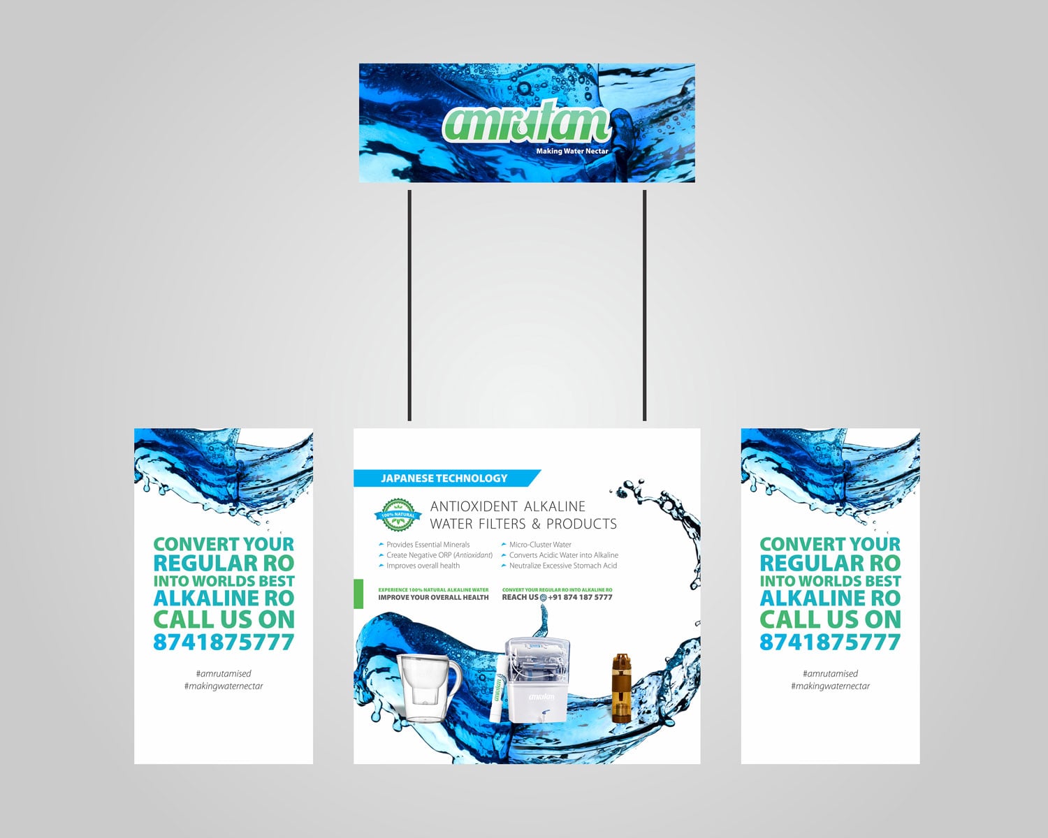
- Amrutam
- Identity
- Packaging
The result
- wholesale ready
- Day-1
The story
The brief
A wordmark and a packaging system, plus a content engine for an ayurveda-first FMCG.
The kind of problem
Projects like this usually exist to fix one of a few familiar problems. These are the ones we see most often in branding & identity work.
- A brand that only works on one surfaceA tidy website and a prospectus that looks like someone else's. We design for every touchpoint a customer meets.
- No rules for the next personAn identity that decays the moment the designer leaves. Guidelines and templates keep it coherent without us.
What we made
- IdentityRules for colour, typography, imagery and layout. Together they make the brand recognisable without the logo on the page.
- PackagingPack structure and graphics designed as a family. Each variant is distinct on the shelf and still obviously one brand.
How work like this runs
Amrutam’s published scope was identity and packaging. This is how our branding & identity work is run, from first conversation to handover.
Listen and audit
We read your category and your customers, then your current materials. We note where the brand argues with itself.
Find the position
One clear argument, written down in plain language before any pixel is drawn.
Design the system
The chosen route becomes a full identity. It covers the mark and the colour, the type and the imagery, with the rules to keep them together.
Apply and hand over
We design the real applications: print, packaging, digital, then document the system so your team can run it.
If you are facing something similar
Before you commission a rebrand or a first identity: six things worth settling first, whoever you hire.
List every place the brand shows up
Prospectus, packaging, signage, invoices, social, the website. An identity is judged on its weakest surface, so know the surfaces before you scope the work.
Collect what you already have
Old logos, printed pieces, photographs, reviews. Some of it is equity worth keeping and some is baggage; you cannot tell until it is on one table.
Agree who owns the files
Source files, fonts and licences should be yours at handover. Get that in writing before work begins.
Ask for guidelines your team can run
An identity that only the original designer can apply will drift within a year. Templates and clear rules keep it coherent without us.
Design the pack and the thumbnail together
A pack that is beautiful in hand but unreadable at 200 pixels loses online. Test both before print.
Prepare for wholesale from day one
Retailers ask for hangtags, line sheets and consistent photography. Plan those early and the first order goes smoother.
What usually goes wrong
Three patterns we meet often in branding & identity work, and the quiet cost of each.
Treating launch day as the finish
An identity matters in the second year, when a new person has to apply it. Without templates and rules it drifts back to whatever is quickest.
Starting with the logo
A mark drawn before the argument is settled gets judged on taste. Three rounds later nobody remembers what it was supposed to say.
Borrowing the category's look
If every competitor uses the same blue and the same symbol, matching them makes you invisible. The category's habits are the first thing to question.
Where this sits
Strategic positioning and a visual identity that earns the price you want to charge.
- VolimyA debossed mark for a category-creator
- PureEarthAn identity that reads as a promise
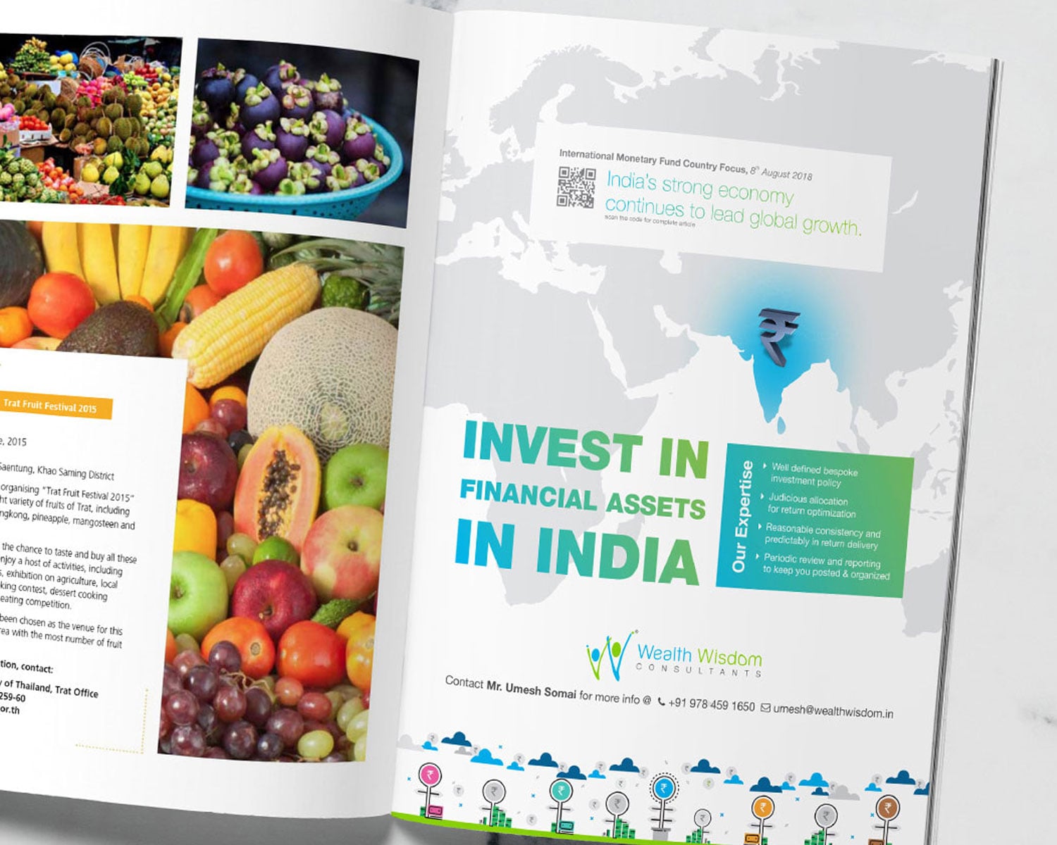
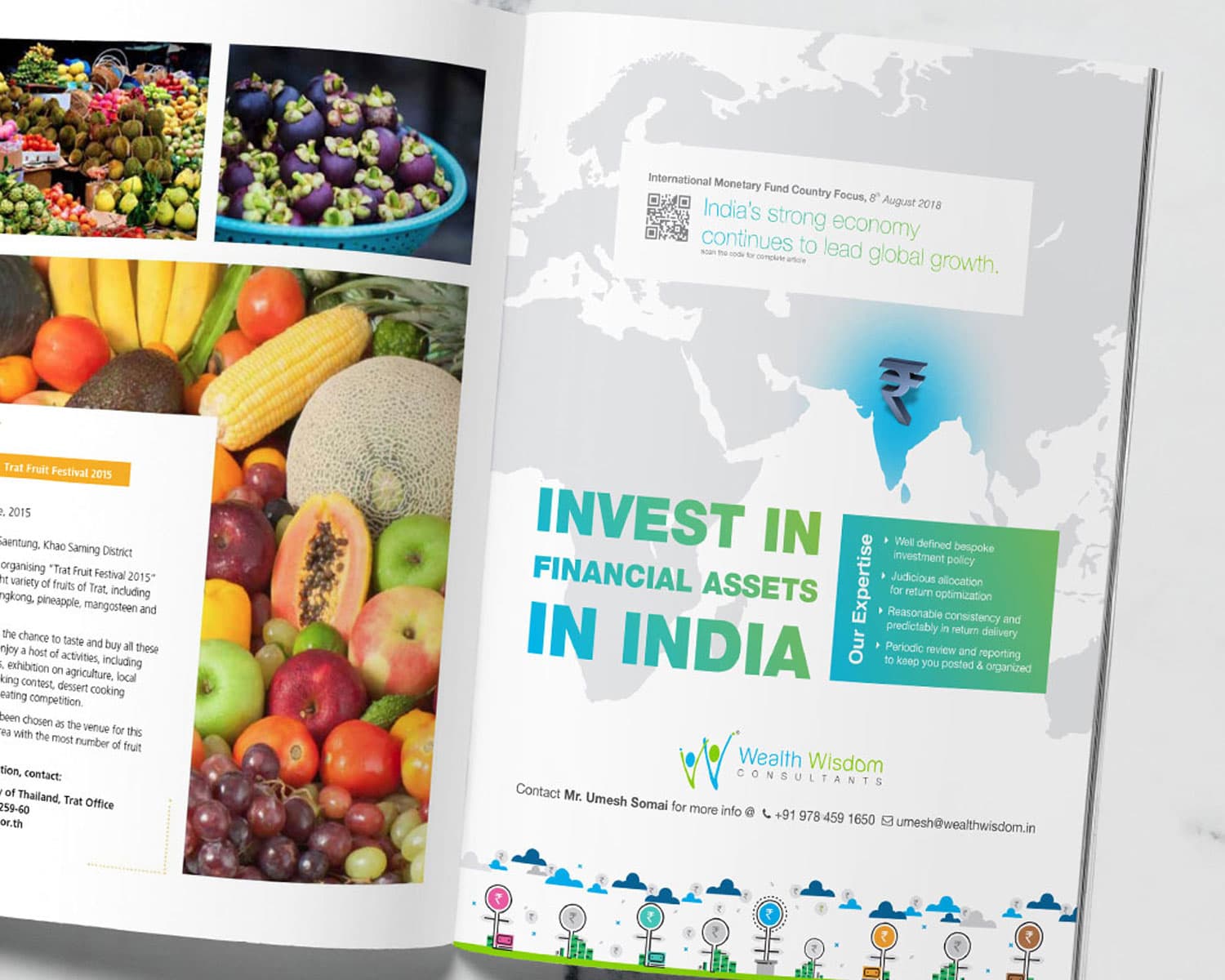
- Wealth Wisdom ConsultantsA refresh from W to W+
Heritage labels, new launches, packaging-first identities. We design for the shelf and the scroll.
Direct-to-consumer brands live on two surfaces at once: the shelf or the delivery box, and the scroll. The identity has to work in a hand and in a thumbnail. It has to work on a retailer's display as well.
Most struggle to look distinctive in crowded categories like wellness, fashion and food. Trends move quickly there. Packaging has a second to explain the product.
Our work in D2CQuestions about projects like this.
Something we haven’t covered? Ask us.
What did the Amrutam project include?
The published scope was identity and packaging, for Amrutam (D2C, Wellness). The pieces delivered are listed above, with what each is for.
What is the real difference between a logo and an identity system?
A logo is one mark. An identity system is everything around it: colour, type, imagery, layout and tone. With a system the brand stays recognisable when the logo is missing. Most brands that feel inconsistent have a logo and no system.
How long does an identity project run?
It depends on the scope: a stationery refresh and a packaging system are different jobs. The proposal sets the stages and the dates before work starts, and the published projects on this site show the range, from a 7-week launch to larger rollouts.
Can you work with a brand that is already partly in use?
We audit what exists and keep what is working. What is not working gets replaced. The rollout is planned so old and new versions do not sit side by side for long.
Do you take on more D2C projects like Amrutam?
Yes. Amrutam is one of our published D2C projects, and the D2C page lists the others along with how we approach the category, so you can judge the fit before you write.
Should packaging be designed with the logo or after it?
With it. The identity and the pack are one system. Designed together, they avoid a logo that fails in print or on the shelf.
How do you launch a D2C brand that looks established?
By settling the position and the system first. Then the pack, the photography and the first content are all built from it. The launch looks like one brand.




Have a brief like this one? Let’s talk about your branding & identity.
We reply within one working day, from a person.
See what Branding & Identity starts atFree brand audit
Based in Rajasthan? Branding Agency in Jaipur